In the steady march from the 12-inch square LP and the
7-inch single to the 5-inch CD booklet and, lastly, the 300x300 jpg, certain
effects no longer resonate in quite the same way. This week I found myself
dwelling on the space, clarity, and immediacy achieved by simple, uncluttered
design that maximizes impact by minimizing graphics. On a big playing
field — like that of an LP or 45 — the smaller gestures have greater impact: call
it the lone-voice-crying-out-in-the-darkness effect. I’ve been told the
unoccupied areas are called “negative space,” but every designer I’ve ever met
despises the term. Here are a few exemplars whose oomph would doubtlessly be
diminished as a mini on an iPhone screen.
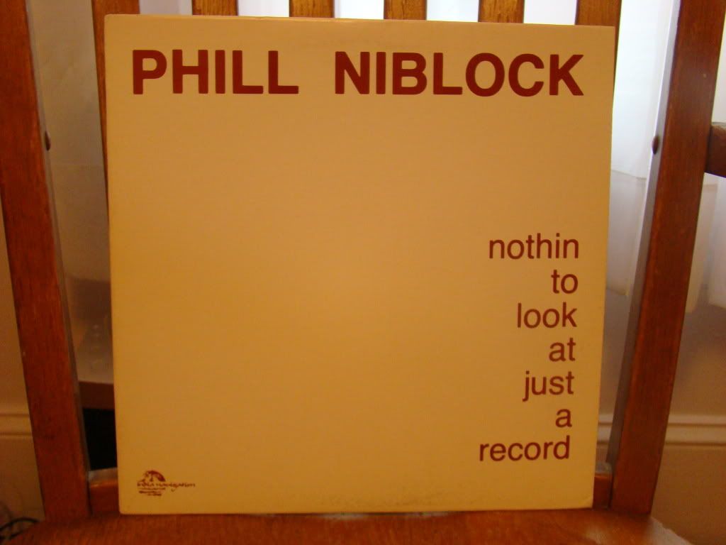
Reverse psychology, perhaps? In its efforts to diminish
itself, this marriage of title and design is only more arresting. It’s a
perfect reflection of the music, which consists of long overlapping drones
created by recording extended trombone notes to magnetic tape and then
carefully editing and overlapping them. The end result is captivating,
revealing a hidden world of harmonic overtones dancing over the music’s
seemingly static palette.
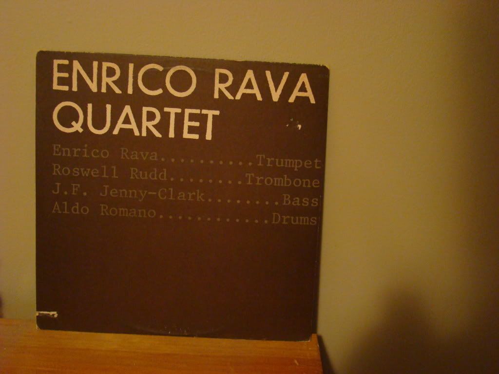
European jazz (and eventually classical) label ECM’s stark designs created
their own visual language, tying together a catalog that is more diverse than
first brush would indicate. Since jazz buffs are obsessed with who-played-what,
ECM did the heavy lifting for us on this one by putting it all up front in an
almost confrontational manner. Those who think of ECM as a home for Nordic
watercolor jazz would be surprised by this one…
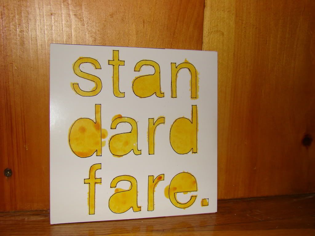
…and speaking of watercolors. I hesitated to put this one here, because the
ratio of content to void is a bit more equivocal, but it still radiates the
assuredness and plaintiveness that’s been intriguing me. Also, the infectiously
bashy English trio STANDARD FARE are
one of my favorite bands to emerge in the past few years, and this single
(“15”) deserves three minutes of your time. Six, actually – play it twice.
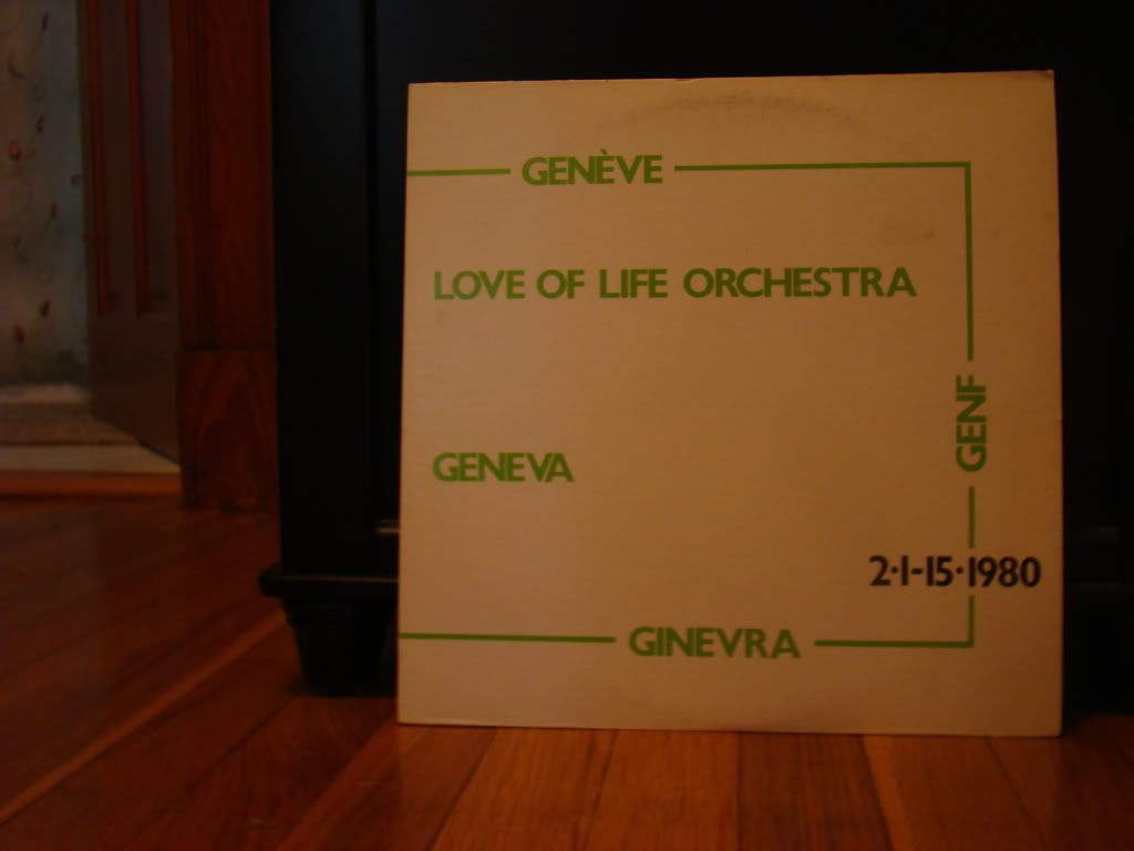
Hip indie label DFA recently did a retrospective of PETER GORDON'S LOVE OF LIFE ORCHESTRA that skipped this,
their first full-length, entirely. While it’s a bit more slick than their
earlier EPs and singles, its interlocking grooves and keen use of dissonance is
still quite fascinating. And look at that cover! Note: I picked this up at
Weirdo Records in Central Square. One week later, I saw a bootleg CD of it in a
cool downtown New York shop for three times the price. Lesson: please support
your local shops, and they will support you.
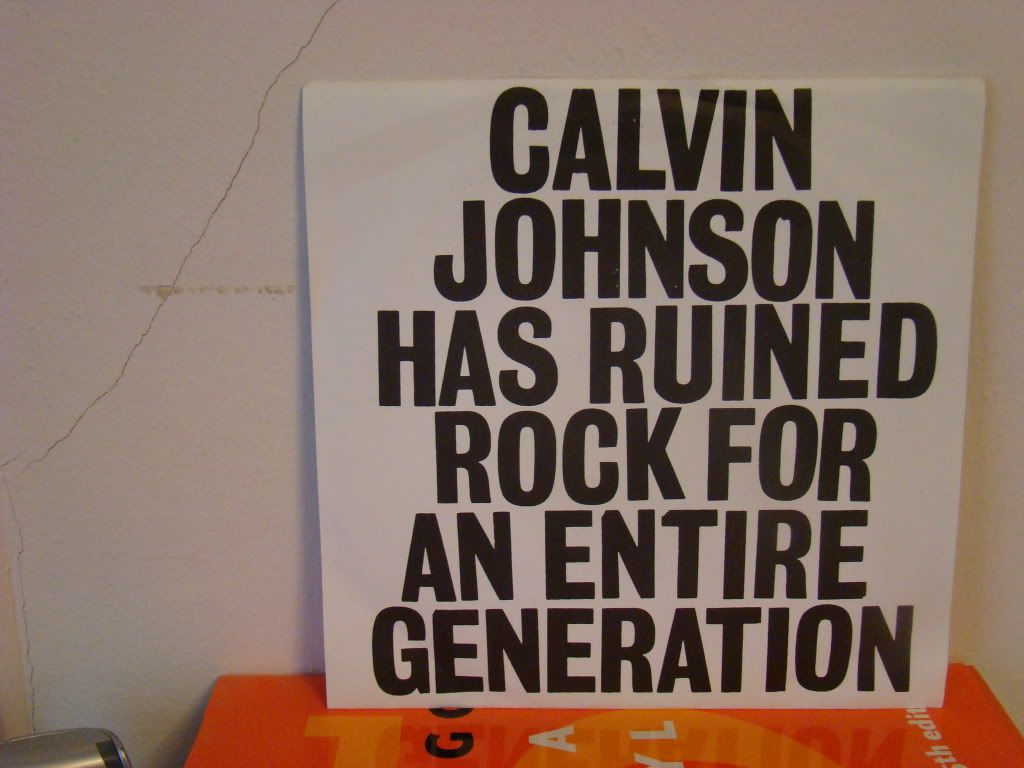
With a title this great, who needs a design, right? The artist is ALAN LICHT,
and this single contains dedications to Nikki Sixx and Tone Loc. And the liner
notes boast scattered references to Ted Nugent. Ok, then…
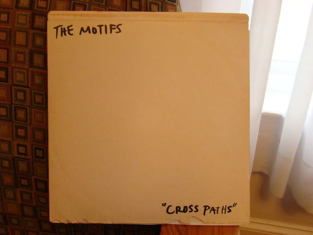
Australian indiepop band THE MOTIFS played a rare set in Somerville back in May, and I snagged this copy of their sole LP from them. Minimalist design as pure DIY expression. Rather than have jackets printed (expensive and impersonal), they dismantled and reversed existing sleeves (note the rips along the bottom – this one is a Ray Conniff disk called 'S Wonderful) and drew their own covers with Sharpies. The back contains hand-written track titles. This one was done rather quickly, but doesn't suffer from haste. It suits the hushed, homemade music rather perfectly.
Brad San Martin is a multi-instrumentalist and songwriter in the
Boston-based indie-pop trio One Happy Island, who will be clattering away from
10am until noon-ish this Saturday, August 13, at the Union Square Farmer’s
Market. His recently minted VinylSighting blog is a welcome addition to On The
Download, despite the shortcomings of not being able to download a vinyl record.