At Carroll and Sons, the detached tone of the Boston cityscapes from 1974 and '75 leaves me cold. He photographed the city again from 2001 to '04, drawn in part by all the Big Dig construction. As in the '70s photos, he uses an 8x10 view camera and prints without enlargement from the negative for rich detail. But this time the buildings feel close up and tightly packed together in a way that suggests the snug density of the city. In photos from the past year, Nixon has switched to an 11x14 camera (again printing without enlargement) and a lower vantage point. Instead of looking out or down from 30 stories up, he's now eight or nine stories up and looking across and straight through.
The photos from the past decade have an appealing sense of being in the thick of things while at the same time being Modernist formal studies. View of State Street Bank, Boston (2002) delights in the overlapping, lit-up skyscraper windows, in the rhythm of all the rectangles and stripes, in the contrasting grids of the modern architecture. South View from the Custom House, Boston (2001) explores the same patterns, this time accented by the Custom House tower's wiggly reflection in the scale-like windows of a near-by skyscraper. Everything is scrupulously arranged: Nixon aligns the point of a building right against a photo's edge, or he finds the spot where the buildings frame a slice of harbor. It's about precise placement, like a game of Tetris. I admire the work; I don't adore it.
Another sign of Boston's photography focus is that each spring, it seems, a new photographer emerges from one of our local MFA programs (usually MassArt, where Nixon, Morell, and McPhee teach) and can be seen everywhere in town — commercial galleries, academic halls, museums. In 2006, it was Claire Beckett with her staged shots of soldiers. Last spring, it was Clint Baclawski with his scenes of trade shows and public spectacles. For the most part, these artists work in medium or large format, and with the deadpan affect that has come to dominate much of art photography, part of a lineage from Walker Evans to "New Topographics" to now.
Joe Johnson's large color photos of nocturnal Boston were a sensation when he graduated from MassArt in 2004. They might have been a bit too reminiscent of Edward Hopper, but then, that was part of their appeal — that fix of the lonely noir city at night.

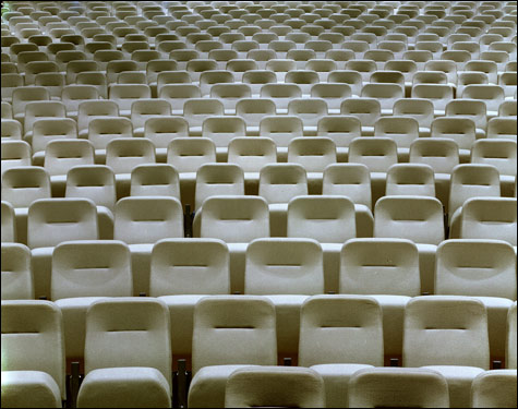
SEATING, TEMPERANCE MI (2002) You could say Johnson simply shows what is; you could also argue he's stacked the deck. |
He left Boston to teach at the University of Missouri. Now, Gallery Kayafas is exhibiting his recent large color photos of Midwest mega-churches. One photo shows endless rows of gray stadium seating. Another depicts what looks like a TV anchorman's desk (surrounded by glowing TV screens) plopped down in the middle of a Roman villa. Still other shots show an artificial Eden behind too-white columns, a plaster jail liberally doused with fake blood, a neon outline of a dove in front of balcony seats, the pattern of a vast carpet. There's a chintzy, synthetic, mall style to the churches that seems quintessentially early-21st-century American.Mega-churches, as a driving force behind contemporary Christianity and its place in public life, are an intriguing and timely subject. The photos are well made, but Johnson's style here is indistinguishable from that of the horde of young deadpan photographers. And I feel he doesn't give the churches a fair shake.