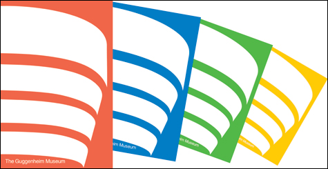
VISUAL ZIP: Grear’s 1969 Guggenheim poster. |
In 1969, Malcolm Grear Designers was hired by New York’s Guggenheim Museum to develop a new graphic identity for the institution. One of the results was a series of posters that boiled down the building’s trademark spiraling architecture into a design of four flat curving stripes that feel like the ideal form of the building that hovers in our minds.
Seen in the exhibition “Inside/Outside: Design and Process, Malcolm Grear Designers” at Rhode Island College’s Bannister Gallery (600 Mount Pleasant Avenue, Providence, through April 24), the posters remain strikingly fresh. It’s obvious why the image helped lead to the firm doing all of the Guggenheim’s graphic designs — posters, books, invites, signs, gift bags — from 1969 to 1990.
“Inside/Outside” presents a trade show-like retrospective of the work of the Providence graphic design firm, which longtime RISD teacher Malcolm Grear founded in 1960. Here are examples of logos, package design, textbooks, exhibition catalogues, posters, signs, Olympic medals, and museum exhibits that it has produced. And there are plenty of sketches and mock-ups that give glimpses into the firm’s process.
This is mostly sleek, reserved, classical, fade-into-the-background design. The firm’s style exemplifies high American modernism, rooted in cool geometric ’60s minimalism. Grear’s individual style is most apparent in the firm’s logo design, including work for the Providence Journal Company (1972), the Rhode Island Department of Health (2007), and numerous other companies and agencies.
“Even though nothing is timeless, it should be as timeless as possible,” Grear says in a video here. In practice, that usually means a graphic essentialism that aims to boil down the client’s attributes into crystal-clear, elemental logos. But the firm’s graphic stripping away can sometimes result in a generic blandness typical of suburban office parks, as in a blocky geometric “VA” logo for the US Veterans Administration in 1978.

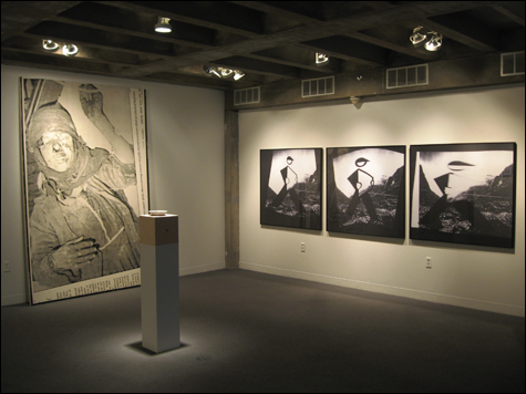
POSTMODERN CHANNEL SURFING: Mayer’s work at the Chazan. |
In the past decade or so, Malcolm Grear Designers seems to have opened up a bit from its focus on basic geometry. A 1999 logo for the New Bedford Whaling Museum features a whale’s tail silhouetted against three square-rigged sails. A 2001 logo for Vanderbilt University changes up a classical “V” by turning the valley between the two arms of the letter into the silhouette of an oak leaf and acorn. The designs have the firm’s typical crisp simplicity, but offer more personality because they retain something of the idiosyncrasy of the world.
And that is the power of the firm’s best work. The Guggenheim posters have such zip not because they transformed the building’s structure into geometry, but because the simplified version of the building’s dramatic curves channeled the essential unusual feel of the place.The Chazan Gallery (at the Wheeler School, 228 Angell Street, Providence, through April 20) presents “Soundless,” featuring works by Roger Mayer, a Smith¬field resident, RISD grad, and emeritus professor of art and semiotics at Brown. And they feel like the works of a professor of art and semiotics. Appropriated images — newspaper clippings, snippets from magazines or television — are grouped, mutated, and blurred one into the next. It looks like postmodern channel surfing.
Typical of his work is this insomniac, Berlin (1988), in which four seemingly unrelated images are lined up side by side. We see people cleaning up rubble outside a Berlin building at the end of World War II, a sultry woman perhaps from a fashion spread or soap opera, a blurry picture that might show someone behind the wheel of a car, and a blurry blow-up of the head of a woman, apparently with her mouth open and her arm raised. They look like large photocopies. Together they have a certain graphic stylishness, but I’m not sure what it adds up to.
Across the room is woman wounded in 1991 in Iraq (1991), which appears to be a large blowup of a newspaper clipping mounted on canvas. It shows a black and white photo of a woman slumped on her side with her face bloodied. Mayer turns her upright, so she stares directly at us. Running along the side is a caption: “A Jordanian newspaper photo shows an Iraqi woman allegedly injured in a recent allied air attack of Baghdad.” The word “allegedly” sticks in the mind. In ret rospect, the artwork feels like a monument to our extreme skepticism of any information originating from Saddam Hussein’s Iraq, and how badly it lead us astray.